Booking website designs for makeup artists
The same artist, services, prices, and booking flow can feel editorial, cinematic, calm, minimal, romantic, or playful. The difference is in the hierarchy.

A makeup artist website has two jobs. It should make the work feel considered, then help a client act while their interest is high. That means photography, service details, prices, location, and the booking button need a deliberate order.
Every design below uses the same demo business, Elena Bisset Makeup in Soho, New York. Each one has the same useful information. What changes is how the page uses type, color, imagery, spacing, and horizontal space to express the artist's brand.
What every design keeps clear
Clients can still understand the artist's specialty, compare services, see duration and pricing, review recent work, and start a booking request. The style changes without turning the page into a decorative mood board.
Distinct ways to present the same business
Each layout was designed separately for its visual direction. They are not one template with a different accent color. Here is the collection so far.

Magazine-cover confidence
Poppy opens on one full-width portrait and nothing else. The name sits under it in a large red serif, the way a cover line sits under a cover shot. A butter-yellow band carries the introduction, and the Book button stays red in the corner the whole way down.
Best for: artists with one photograph they would happily put on a magazine cover.
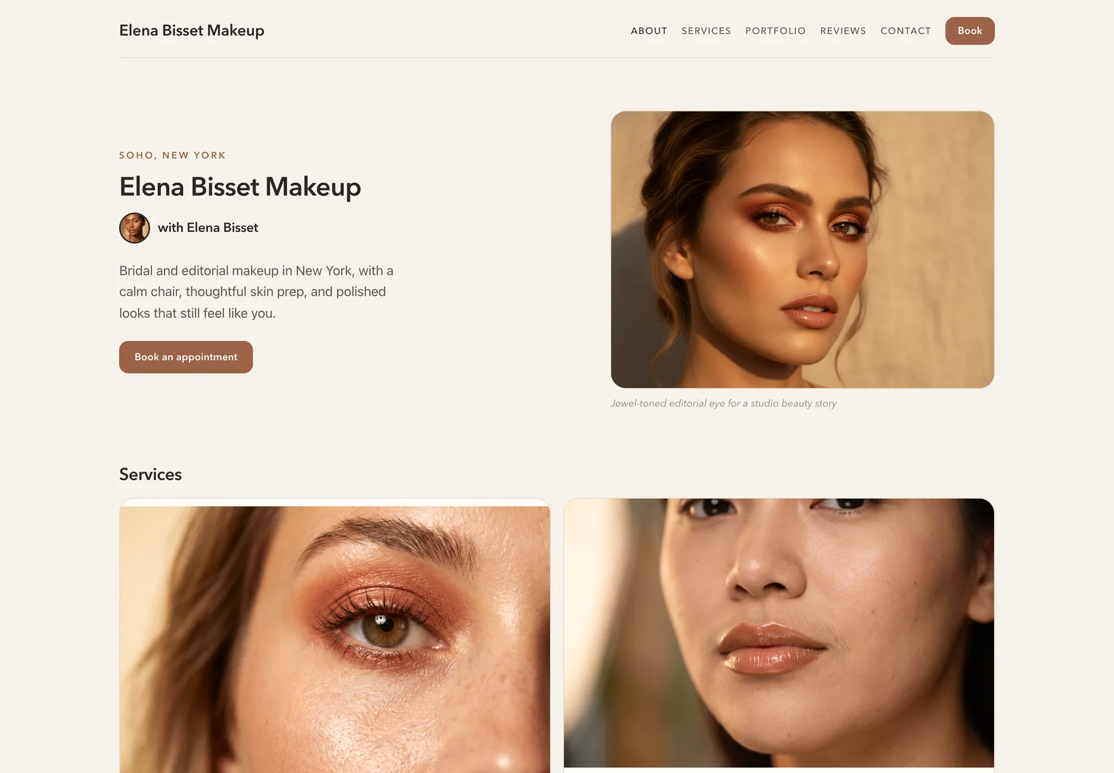
Warm editorial restraint
Linen pairs a quiet neutral palette with a large image, compact introduction, and generous service cards. The page feels personal without becoming rustic, and the warm booking action is easy to find.
Best for: bridal, beauty, and editorial artists with polished portrait photography.
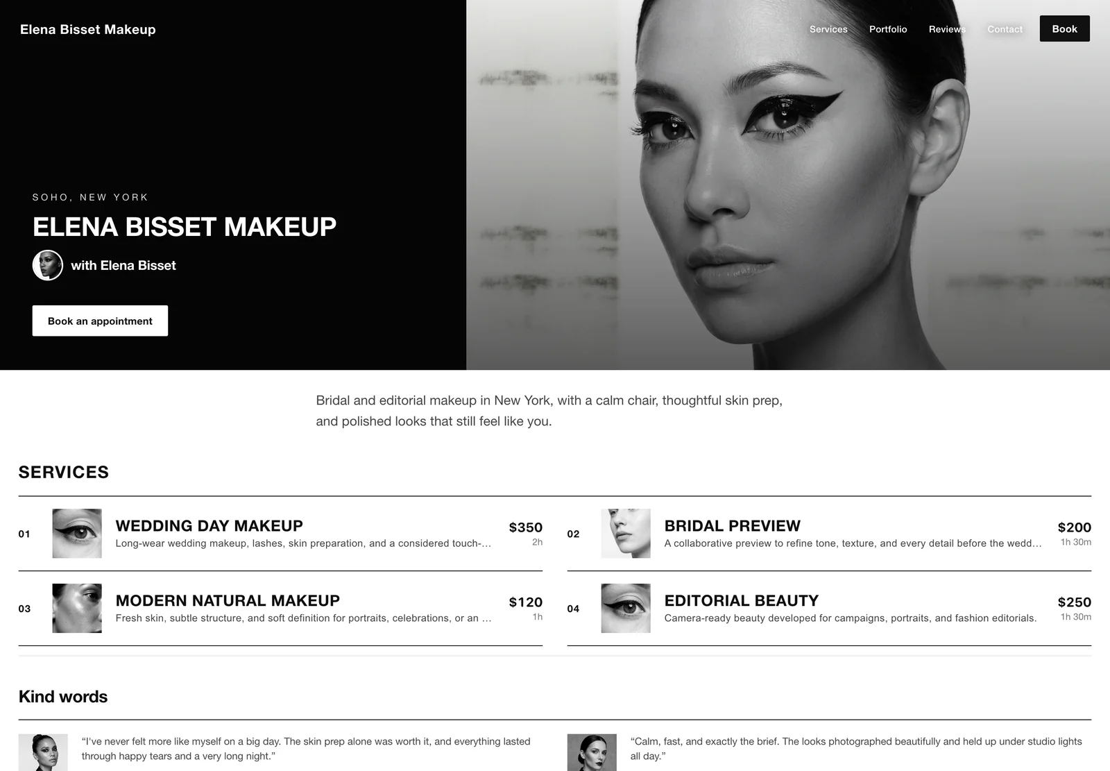
Graphic and fashion-led
Blanc uses sharp contrast, an image-led split hero, uppercase display type, and a numbered service index. It fits more information into the first screen while keeping the page disciplined and readable.
Best for: fashion, editorial, campaign, and studio artists who prefer a monochrome identity.
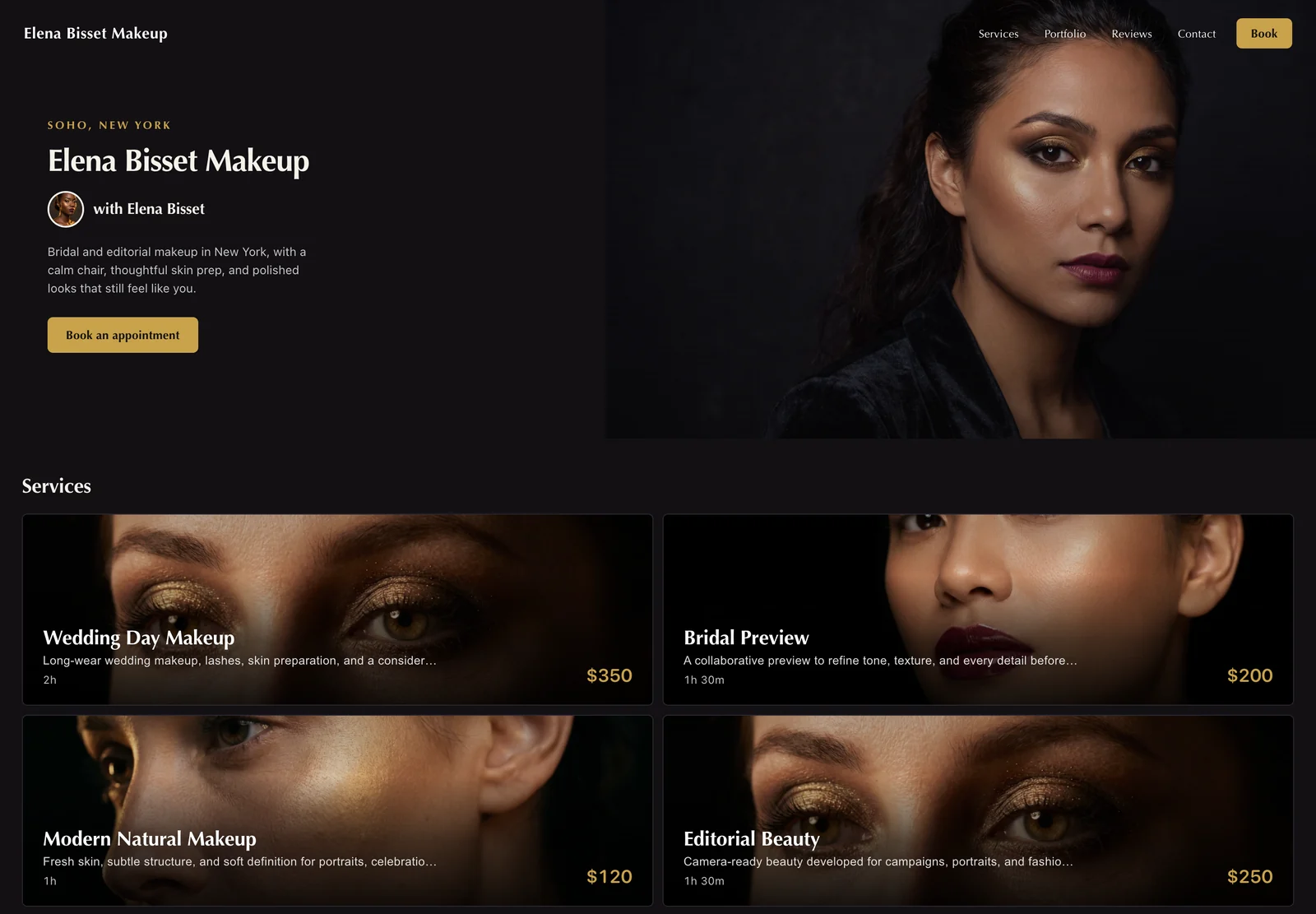
Cinematic contrast
Noir gives dramatic makeup photography room to lead. Gold details keep calls to action visible against the black surface, while image banners turn the service menu into part of the portfolio.
Best for: evening, glam, editorial, and high-contrast portfolios.
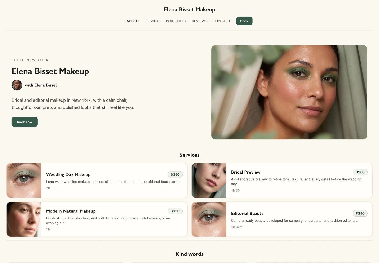
Calm, structured, and contemporary
Ivy balances an asymmetrical introduction with a wide portrait and clean horizontal service rows. The muted green accent feels grounded, and the layout uses the desktop width without stretching the text.
Best for: natural beauty, skin-focused, personal brand, and modern bridal work.
Airy minimalism
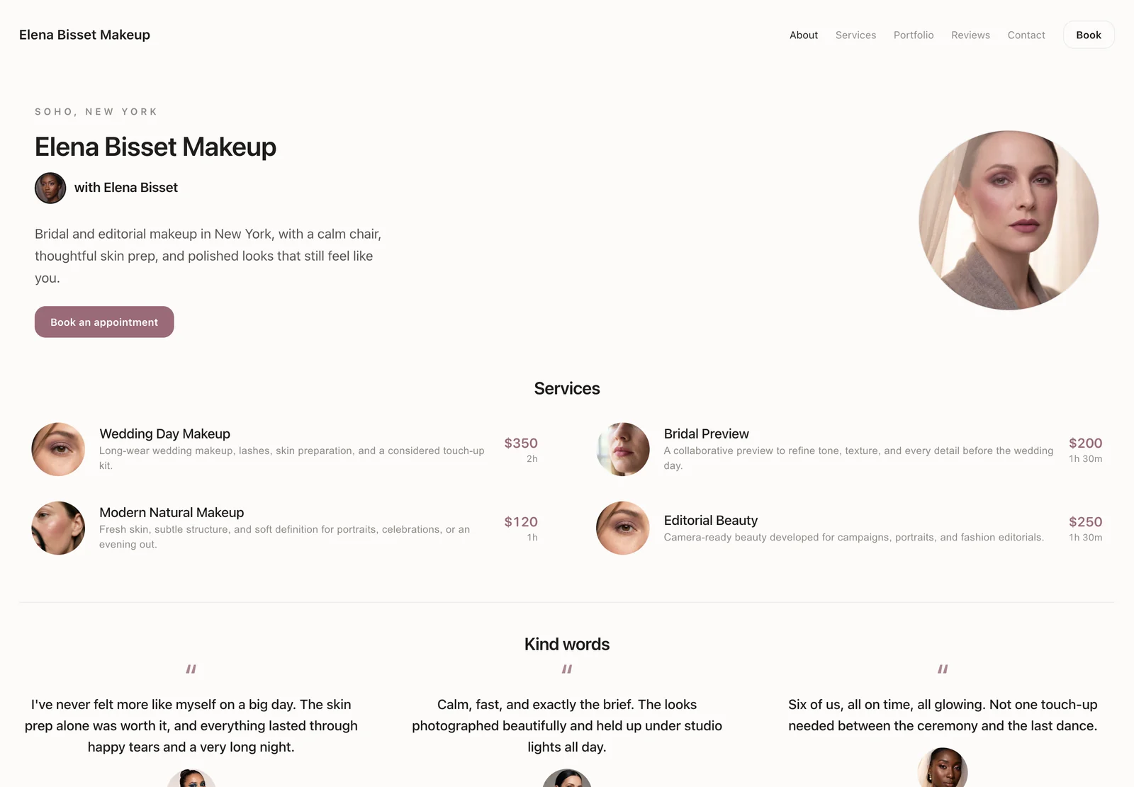
Haze keeps the introduction centered and uses a soft image crop, restrained rose accent, and light service rows. It is the quietest design here, with enough detail to book confidently and very little visual noise.
Best for: refined personal brands, soft glam, skincare-led beauty, and concise service menus.
Soft, romantic polish
Rosewater layers a raised introduction panel over the portrait and carries the same rounded treatment into its service cards. The result feels bridal and romantic while the price, duration, and booking action remain direct.
Best for: bridal, romantic beauty, occasion makeup, and soft glam portfolios.
Bright, soft, and tactile
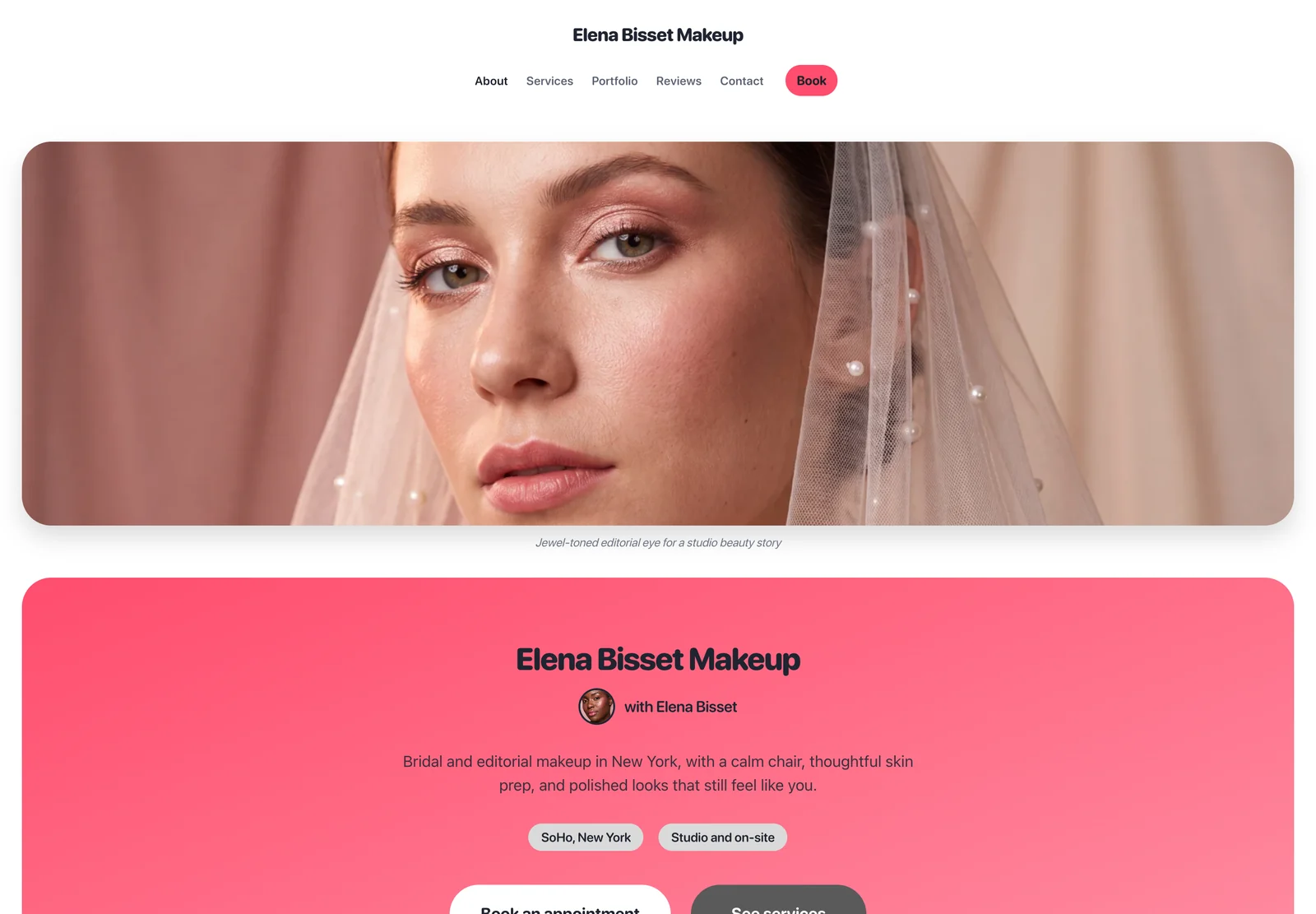
Sorbet is the only design that opens on colour instead of a photograph. A coral gradient carries the name, a row of plain-spoken facts sits under it, and the buttons are soft bodied: press one and it gives, then settles. It is the loudest design in the set and the least interested in restraint.
Best for: colourful, playful, and modern beauty brands with a younger audience.
Quiet and professional
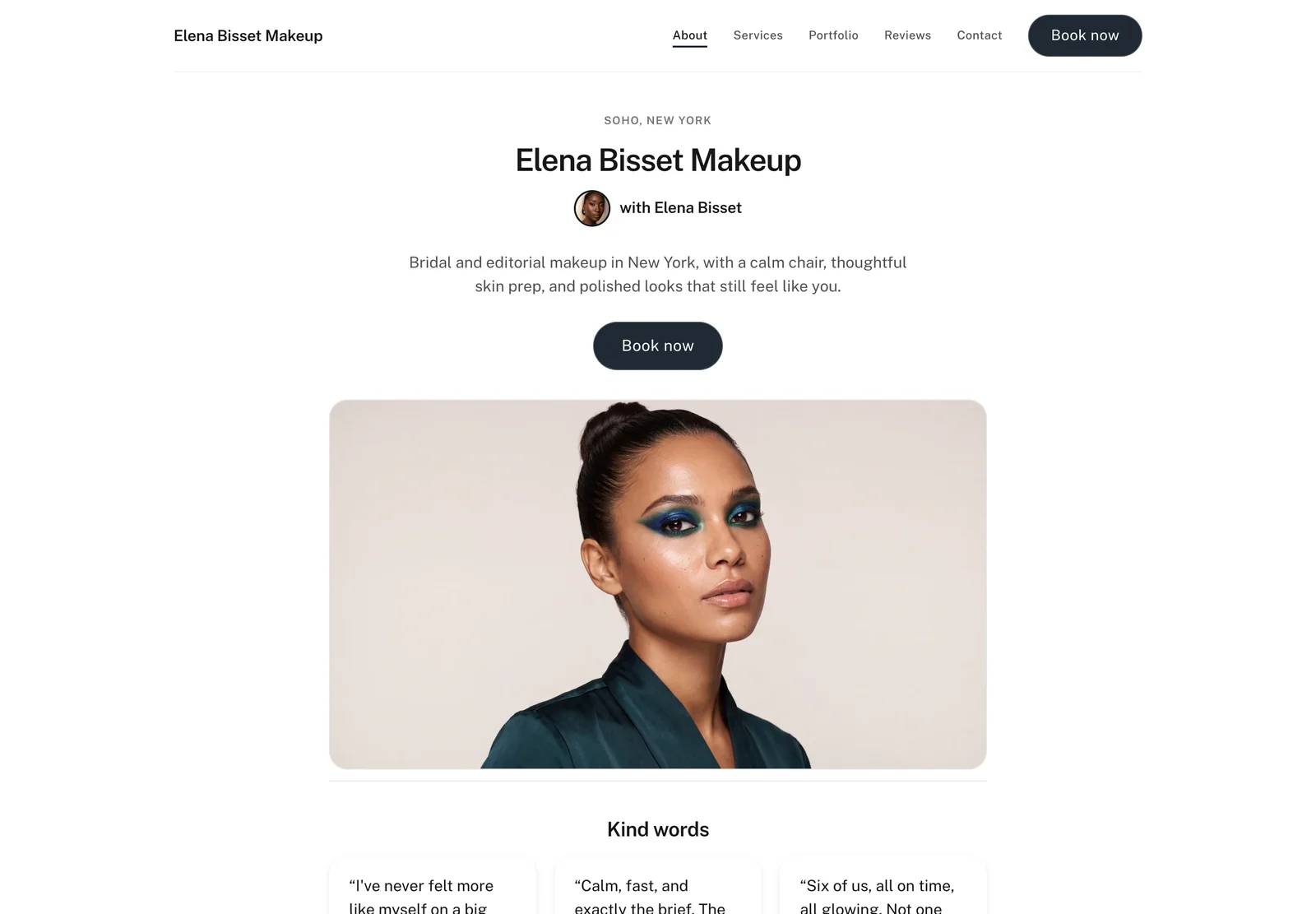
Studio is the plainest design here, and that is the point. Centred type, one framed portrait, and a dark Book button. Nothing competes with the work or the price, which makes it the safest choice when you are not sure yet.
Best for: a first booking page, mixed portfolios, and anyone who wants the work to be the only strong opinion on the page.
The collection keeps growing
New designs are added over time, and each one arrives in your Branding settings on the day it ships. There is nothing to update and nothing to rebuild. Pick a new look and your booking page changes, while your services, prices, photos, and booking steps stay exactly as you set them.
Where to look: Settings, then Website, then Branding.
How to choose a makeup artist website design
Choose the structure that supports the material you already have. A dark cinematic design will not rescue inconsistent photography, and a very minimal layout can feel empty when a service menu needs more explanation.
Start with your photography
Strong, consistent portraits can carry Noir or Blanc. A varied portfolio is often easier to present in Linen, Ivy, Haze, or Rosewater.
Match the service menu
Numbered rows suit concise menus. Larger cards give descriptions, prices, and service images more room to work together.
Check the phone layout
Most bio-link visitors arrive on a phone. The first screen should identify the artist, show the work, and keep the booking action visible.
Common questions
Can makeup artists choose a booking website design in MUA Studio?
Yes. Each design changes the layout, fonts, colors, photos, and service style. Your information and booking steps stay the same.
Do the designs work on phones?
Yes. Every design is made to work well on a phone, with clear services, prices, and a booking button.
What changes between designs?
The page structure, display type, spacing, colors, image shapes, and service hierarchy change. The profile, services, pricing, portfolio, contact details, and booking flow remain consistent.